SEE ATTACHED
Find an advertisement, cartoon, or image on the Internet that depends predominantly (if not entirely) on visual appeals to market a product or make a point. First, identify the central message of this visual. Then, note and discuss how the marketers, cartoonists, or graphic designers seem to have employed visual elements to persuade readers to think a certain way. The more knowledge you have about target readers for the visual, the more effectively you’ll be able to explain the strategies employed to sell the product or point. In addition, analyze the effectiveness (or ineffectiveness) of the visual elements and explain what you learned from writing the analysis.
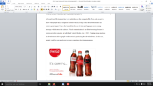
In your introduction, describe the image you are analyzing and the central idea. Include either a copy of the image or a link to where the image can be found. Also, include a thesis statement that reflects the content of your analysis.
In the body of the analysis, discuss the elements used in the visual to get the reader to think a certain way. You might discuss visual elements like shapes, colors, size, shadows, and positions to name a few. Also, discuss the effectiveness (or ineffectiveness) of the visual elements.
End with a brief conclusion that summarizes what you have learned from completing the visual analysis.
Be sure to double-space your assignment.
Length: 400 – 450 words
Please cite all work.
Rubric
ENGL 123 M3 Short Writing Rubric
| Criteria | Ratings | Pts | |||
|---|---|---|---|---|---|
| This criterion is linked to a Learning OutcomeContentThere should be evidence from course content and demonstrate synthesis of concepts. |
|
60.0 pts | |||
| This criterion is linked to a Learning OutcomeMeets the Requirements of the AssignmentShould address given assignment requirements. |
|
20.0 pts | |||
| This criterion is linked to a Learning OutcomeGrammar, Punctuation, Organization, and FormatThe essay is clearly written in an appropriate tone, and it demonstrates a mastery of standard English grammar and sentence structure. Citations and references should follow APA when applicable. |
|
20.0 pts | |||
Total Points: 100.0
|
|||||